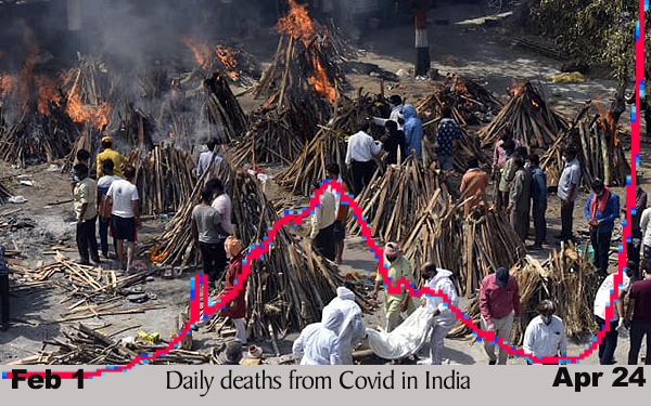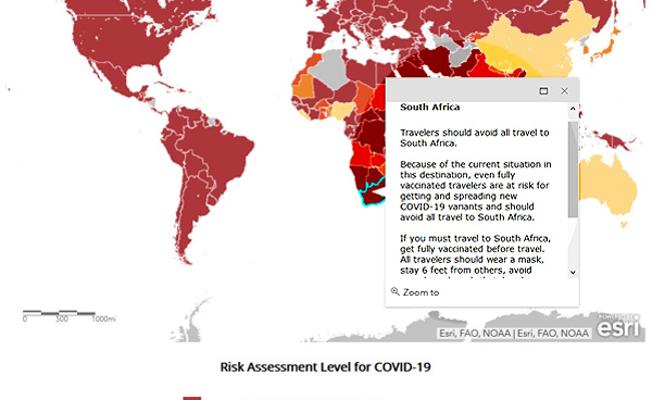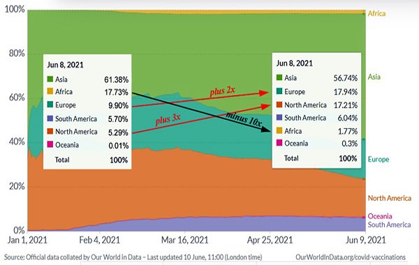
Have you figured out the block chart above yet? According to OurWorldInData.org the color blocks represent the percentages of vaccine doses administered by region of the world. Any surprises?
Of course not. The poorest region, Africa, always gets the short end of the stick. What a shame it’s also where the variants are having their heyday.
Read more